Wednesday, February 3, 2010

Traditional Regalia

Dairy Entry:
Since this time there was nothing to develop we didn't spend time in the dark room. I liked this project because it goes outside of objects and it is very unlikely that one of us is going to have the same shot as another person in our class because we aren't using each other and there for it is a lot more unique. We had to use a lot more photoshop and I have to because my flash kept of making wierd lights on the person and shadows so I had to try to get rid of the shadows and that was pretty challenging. It's also nice how it is going to be part of international day because
usually we take the pictures we need for the project, then we
just hang them up and they are just seen by people that pass by and its pretty interesting how it will take part of international day.

Theory Notes:
Classic Painting:


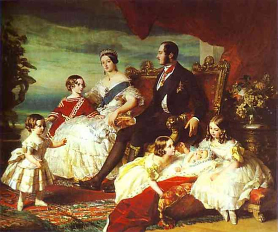
This portrait is from the 1800 of Queen Victoria, Prince Albert and their five children. Even though Queen Victoria and Prince Albert are at the same level Queen Victoria is looking straight ahead and making some sort
of eye contact, whereas Prince Albert is looking complety to the side, kind of uninterested. Also Queen Victoria has her arm around her her son as like he is her heir the next one in line and even though she doesn't have a threatening but she still looks as if she's standing strong.

Contemporary:
This is the Danish Royal family. The way that they are set up is to show that the King and Queen are the core and to their sides are the sons which would be the heirs and then the wives. So in order of importance. Also the King
and Queen are more towards each other once again showing more core like feeling but at the same time there is more of a fe
eling of equality than the more classical.


Compositions:
This is my brother, Tomas and here he is representing Argentina. There actually is a lot more to the traditional costume but I just wanted to draw the eye more to the belt, so the viewer has less things to look at and can concentrate on the belt.


This is Deepakie and she is from India. I've always been a big fan of the Indian culture with all the colours so I really wanted to pick a boring background to make the colours of her sari to stand out.


This is Mathili and she is from South Africa. I really wanted to represent all the colours that are usually seen in the more generalized African culture. This picture was quite the
challenge the to photoshop because the background was originally bright read and it was just too much so it took some
experimenting but I got it to work and I think it looks pretty good.


Image Bank:
Argentinian:

This is pretty typical for the Argentinian with sort of farm like rual
look to it. Even though there is no belt nor did I use a hat like that but that strap around the hat has the same style as the belt.
This picture was taken by Andrew Gibson, who is a writer and a photographer in the south of England. He really loves going to Latin America, specially Argentina, Bolivia and Peru and to try to document the life style.


Indian:
I like how she is sort of praying and how she has every little jewlery on because when I took my picture it was kind of rushed because she had to go practice for her dance for International Day. And I really like the colours and how the background is blurred.

I think that this picture was taken by K
arwa Chauth but I am not sure and I have no imformation about them.


African:


This is exactly what I wanted to try and capture in my picture with the head peace and the jewlery and I like how Mathili and this woman ha
ve this sort of really strong look about them.
This picture was taken by Bill Bachmann, but I could not find much about him.


William Hogarth:


Hogarth was a very important English painter that was born in 1697 and died in 1764. He did things such as
very realistic formal portraits to almost comic like paintings. A lot of his work also suggested some kind of mockery towards the government.

Here are examples of his work.


Ex1:


"The Marriage Contract"

This one is one of more of his serious work but I li
ke how it is not staged and it seems very much as a picture that captured a moment.


Ex 2:

This is more comical of him and it's not showing glamour or anything and doesn't seem as serious as the other.


Annie Leibovitz:

Leibovitz is an American photographer that was born in 1949. She has shot numerous celebrities and she is known for the close collaboration between her and the model.
Here is some of her portrait work.


Ex 1:
She took this picture in October 2009 so it's pretty recent. And of course we all know who this is, Barack Obama and his family. What is interesting is that yes he is using a red tie which usually symbolizes authority but also everyone is at the same level and it just looks like a simple family photograph.


Ex 2:
This is Queen Elizabeth, and this picture was taken during the filming of a two hour documentary about the Queen and her life. What I like about this it that she is looking away but there is still a very strong look about her and her jewelry adds to her importance.


Blog Links:

Saturday, January 2, 2010

Mess

Mess

Typically when one thinks of the word “mess” one thinks of a messy house, a typical teenager’s room or papers all over the place. To be honest those were the first things that came through my mind. The dictionary defines mess as “a dirty, untidy, or disordered condition”. But that was too literal, and also I wanted to create a picture that truly wowed the viewer and I felt that by doing a messy room that would be a little hard to do. I went through ideas and different types of messes, and even though what I stumbled upon and decided to do is a bit clique I felt it could give me the strength I needed for my picture. Thus I chose to do emotional mess. The dictionary had 13 definitions for just the word “mess” and the last definition was “a person whose life or affairs are in a state of confusion, esp. a person with a confused or disorganized moral or psychological outlook.”

When I first thought of emotional mess, words like “crying”, “ sad” came to mind. The initial image in my head was to have a straight head and shoulder shot (preferably with bare shoulders and female), messy hair, smudged eyeliner and with a lot of emotion in the models eye. That was the main thing I was trying to concentrate, to try to really show the viewer the confusion and sadness in the model. I chose to do the picture in black and white because I personally feel that in black and white emotions are transmitted a lot better and it really captures someone eye. I think that I like it so much because in real life everything is in colour and black and white allows for more imagination. But that’s slightly outside of the point.

I used a good friend of mine as the model and at first it was a bit hard to get her to really look sad, not with the make up and the hair because those were easily fixed but to get her to have a sad emotion in her eyes. I took over 25 pictures and I just snapped away to try and catch that one picture that really shows what I wanted. After a while I decided to let her position herself in what she felt was most efficient for the shot. And after a while it was more natural for her and she started thinking of the dog that she left in Costa Rica and then that’s when true sad eyes started to appear. I actually got rather inspired and it was flash after flash, and I was rather excited.

I usually like to do weird crops in my pictures, crops such as half a face or cutting it off at the top of the forehead and I wasn’t sure if Ms. Dele would like that since she previously said that I make random crops. But I think it fits this picture because then it makes the viewer concentrate more on the eyes and the expression that anything else and that is what I’m trying to achieve. Also I like how she’s looking away, as if she’s too much of a mess or too sad to even look someone straight in the eye.

It was fun to shoot and I think it turned out rather nicely considering that all I had to use was a desk light and my normal digital camera. I wanted there to be more difference between the side of the face that had the light on it and make it a lot darker on the other side but my flash would always go off and if I had it off it would go blurry. But I think that it still manages to look good and there is still quite a difference between both sides of the face.

I did a little tweaking with Photoshop and I just made there be more lines and played around with the contrast and exposure.

I found a photographer called Raphael Guarino. He takes some amazing portraits in black and white. He takes from a very elderly woman with the most interesting faces to angsty teenagers. All his pictures have very interesting lighting and they all show a lot of emotions, but the emotions seem to mostly be sadness or anger. Sadly I could not find a lot about him personally but his pictures really struck me because that is the type of pictures that I love and that I find most interesting.

It was pretty hard to actually try to string in what I thought of emotional mess into one picture and actually having to get the model to get pretty personal and get physically upset. But thank god that she’s a good friend of mine and that she was able to help me. I was a little bit scared to how well my picture would come out because I don’t have the best camera ever and I wasn’t sure if what I had in my mind was going to be able to translate into a picture. That always happens to me, I have this image in my head and then I cant really express it in photography or drawing or anything like that so that was one thing that I was excited to see how it came out. I am happy about how it came out and I think that it effectively expresses what I wanted to do. Maybe the word that comes to mind is not mess but I definitely think that “sad” or “broken” comes to mind, which I think fit very nicely to “emotional mess”. I was pretty happy with my word because it wasn’t too hard to think of something and I know that some other of my classmates did have a hard time to come up with a picture to take but overall I think I really captured what “mess” means to me.

Raphael Guarino website here.

Tuesday, November 24, 2009

Re-Creating Film Stills

Diary Entry:
This project was rather interesting, and I really liked how we had to very carefully look at how the light affects the image. It could get rather tideuous specially when the rest of the class wasn't helping much or we were all tired but I tried to help others as much as I could. It was so annoying that we could not turn off the cealing lights because they did affect our pictures but I think that we still managed to make it work. I was lucky enough to not have to re-shoot, this was a project I would have not liked re-shooting. In the dark room things went pretty quickly since my times were pretty low. Overall it was an interesting project and it taught us a lot more about lighting.

Theory Notes:
40s:
Lifeboat-> Jenny

It was hard to find a picture from the 40s and this was the best one I could find that resembled the picture of Jenny. Here the woman looks rather sad and since it's called "Lifeboat" I doubt that it is a very happy scene but they are both looking to the side and the lighting is actually pretty similar since there is more light on her left cheek than her right cheek.


60s:
West Side Story-> Jenny & Fabrizio

I find this still to be pretty similar to my still expect for the lighting which is rather different. Here the lighting on the man is more on his cheek than on his eyes or nose but on the still the light is all over the face.


Now:
Inglorious Basterds-> group picture
I think that is pretty funny because of the mens facial expression and in the still there is a man with a pretty funny face. This one didn't have much limitations because it was made 2009, in fact it was made after Simone so it's possible that it has less limitations.


Printing Compositions:
Contact Sheet:
Ap:5.6
Time:5


Still #1
Original Screen Still:


Digital Test Shots:


Final Print:
Ap:5.6
Time:7

This is probably my favourite picture of the bunch, mostly because of Fabrizio's face and it just looks rather esthetically pleasing. It did take rather long to set it up but it turned out rather good in the end.


Still #2:
Original Screen Still:


Digital Test Shots:


Final Print:
Ap:5.6
Time:8

I like how Jenny looks very natural, and I find that it was a fantastic idea to have her talk to Fabrizio since the original film still is of the woman talking.


Still #3:
Original Screen Still:


Digital Test Shots:


Final Print:

Ap:8
Time: 19

This picture isn't one of my favourites, I don't know it just doesn't say much to me and I don't really like how you can see the beam of light.


Image Bank:

This if from a movie called The Edge of Love made in 2008. What I mainly love about this picture is the vividness of all the colours. But there is some kind of spotlight on her because she is more lit than the people behind here. Also the light seems to be more concentrated on the top half of her body, thus supporting my theory of a possible spot light.
This still was taken by Liam Daniel. He has been doing film photography since 1989 and the first film he worked at was called The Garden. He enjoys black and white photography but because of the demand he has to do digital but he still enjoys using all the technology. He lives in North West London with his partner and two daughters.


This film still is from a movie called The Final Season, made in 2007. What I like about this one is that the men aren't in the middle of the picture and how the light seems somewhat more natural. Even though they have a lot of shadows all over and they are casting shadows, it is still possible to see their faces.
This was taken by Patti Arpaia, unfortunately I didn't find much information about her.


This film still is from a movie called Waking Up in Reno made in 2001. What I like about this one is that the lighting is very strong, and there is a variation of shadows on each person. For example, the man on the right has a lot of shadow on his main facial features therefor it's hard to see his face. Then the man on the left has light all over his face making it easier to see him.
This was taken by Elliot Marks, he was born in Canada in 1914 and after doing wildlife photography, he Jonathan Livingston Seagull in 1973. He has photographed for some very well known films, such as the Pirates of the Caribbean. Unfortunately he died in 2003.

Mirjana Vrbaski:
Mirjana was born in Canada and grew up in Serbia, and she has been living in The Netherlands since 2008. She studied English lit. at the University of Guelph in Canada. She has done/will do exhibitions in group but she does solo ones as well. Her style is very simple but then again very complicated. She is quite the perfectionist and likes her picture to remind her of a certain historical time.
I really like this picture because it's rather simple but yet again it's nice. It's hard to explain but I like her lost expression and how she seems to not even notice the camera. Which if I remember correctly that is what Mirjana likes from her models.


What I like most of this picture is her body language and her facial expression. She seems sort of shy or scared. I like the contrast between the white she is wearing and the seat and the background. I also love how it looks like a very realistic painting, in some parts it seems as if you could possibly see the brush strokes.


I find this picture very intriguing and kind of scary. For me it shows the quiet side in everyone and the scary, almost demonic side in everyone. I wonder how the model got her face like that, but overall it is definitely a picture that makes one think.


Tuesday, October 6, 2009

Lighting III

Diary Entry:
This time I didn't really have any troubles, it was all very quick. I think something that helped was that this time I used Shani's camera and the one that I used for the last project, I just can't use it properly so hopefully I'll be able to get my camera fixed over the October break.
The developing process was very fast. I made my contact sheet and all of my three prints in one class, probably the fastest I've developed.

Image bank (Flashes and light meters):
Flashes:
  • A flash is a device used in photography that produces a flash of artificial light to illuminate what is being photographed.
  • When using flash the photograph is being exposed to two lights; the ambient light and the light from the flash.
  • Changing the shutter speed won't affect the flash, but changing the ISO will.
  • For more info click here.

<----Flash


Light Meters:
  • It is used to determine the proper exposure for the photograph.
  • There are two types of light metering: 1) Reflective: these meters measure the light being reflected off the subject. 2) Incident: these measure the light falling onto the subject.
  • For more info click here.


<----Light meter


Printing Compositions:
Contact sheet:

Ap:2.8
Time: 3


Two Subjects:
Test Strips:
Ap:2.8


[ 9 ]-------------- [ 7 ]------ [ 5 ] ------- [ 3 ]
In this test strip it was too gray and a bit too grainy so then I closed my aperture.

Ap:4


[ 9 ]------ [ 7 ]----- [ 5 ] ------------[ 3 ]


Print with problem:
I didn't have a copy that was bad of this print.

Final Print:
Ap: 4
Time: 7

What I really like about this print is how it's very natural and it doesn't look posed. Also since their is looking at the camera they aren't the main focus and because it's a head shoulder shot it's easier to look at the hair. Also I like the contrast between the two hair colours.


Close up shot:
Test Strips:
Ap:4
Time:7


Since this picture was taken pretty much right after the two person one I did one test strip with the same time just to make sure there wasn't anything strange with it.

Print with problem:
I didn't have a copy that was bad of this print.

Final Print:
Ap:4
Time: 7

It's a very simple picture yet I like the simplicity of it. Since the wall in the background isn't dark in this picture the focus in mainly on her.


Angle shot:
Test Strips:
Ap: 2.8
Here I went back to the times of the contact sheet because this was shot on a different day than the other prints so the lighting was different. But again it was gray and grainy so I had to close my aperture.

3


5


7


Ap: 4

3


5


7


Print with problem:
I didn't have a copy that was bad of this print.

Final Print:

Ap:4
Time: 8

What I like about this is how its slightly from below creating a sort of angle and also that her head is slightly turned. It's pretty obvious it's a hair picture because it her hair takes up most the picture.
On the real print in her face and on the sky, it's a bit grainy but it's very little.


Image Bank:

Two subjects:
It's a bit hard to say this is a hair shot but it was the only one of two people I could find. I do like how they have nearly the same hair style and also how it's a natural looking picture.
This picture was taken by Luigi Cassinelli, he has a website but he has no information on it. Click here to go to his website.


Close up shot:

I really like how this isn't the typical fancy hair picture one thinks of. It's very natural and the lighting, the make up and the fact that it's in black and white it gives it this much more of an edge that I really like.
This picture was taken by Benn Jae, I couldn't find much more about him other than he is from New York City.
Click here to go to his website.


Angle shot:

I really like this picture because the fact that it's a close-up isn't the only thing that makes a person look just at the hair. The model is only wearing black and then she has this nice dark red hair that makes the viewer look at the hair. Regarding the lighting, I like how there is a soft like on her face, and then in the back of her head it's pretty much all black. Also there is a halo in the back of her head that adds a nice touch.
This picture was taken by Jim Crone. He is a well known photographer for his work in hair and beauty. He is based in the U.K. Many of his photographs have appeared in professional hair advertisements.


Tuesday, September 29, 2009

Lighting II

Diary Entry:
Sadly this wasn't one of my best times in the darkroom. Well the problems started outside of the darkroom. My camera started acting wierd with the battery, it would say I had no more battery when two seconds ago I did! And even when I put a bran new battery it would tell me it was empty. So, Ms.Dele took it to take a look at it and lend me this pretty old camera that I really don't like. It is very hard to focus with it, there is no zoom and it doesn't exactly tell you when you have no more film left. Then the timer of my enlarger got changed, that wasn't too bad but I have to admit I was a bit fustrated. After that I had to change enlarger because a new enlarger got brought in and put in the place where my original enlarger stood.
The new enlarger I moved to was the same type as my old one but the bulb wasn't as strong and it didn't have the numbers on the aperture to see, so then we had to change that. My prints gave my headaches, I think it was because it was so hard to focus with this camera I'm using now that a lot of my pictures came out blurry and they also came out grainy, very very grainy. I was baffeled by the fact that we needed 9 prints but I guess its a live and learn situation and hopefully I will soon have my camera back.


Theory Notes (Shooting in low and sun light):
Low light:
  • When shooting landscape or portrait use tripod, it will allow for better results when using a longer shutter speed.
  • Necessary to raise ISO speed.
  • Simply try to lean against something sturdy.
  • For more info click here.
Sun Light:
  • Try to shoot when the sun is low in the sky. When the sun is up high it causes shadows on the peoples eyes or makes the people squint.
  • Try to make the sunlight hit the model from the side.
  • For more info click here.
Examples:
1) Low light
Here are examples of which shutter speeds and apertures to use when shooting with low light.


2)Sunlight

There kids here were photographed with the sun way up high causing shadows underneath their eyes, and some squinting.


Here the sun is on the side of the subjects face and the late sun gives warmer colours.


Printing Compositions:
Contact sheet:
Ap:4
Time:15
Filter: -


Clothing #1:
Test strips:
Ap: 4
Time:
15


17


19


21


Print with problem:
I didn't have a copy that was bad of this print.


Final print:

Ap: 4
Time:23
F:-

I think this picture is alright. Not my favourite. I would have liked it more if maybe I would have angeled myself more to be facing more directly at him


Clothing #2:

Test strips:
I don't have any test strips for this one because I was really hurring to do this print and I did it mostly by eye.

Print with problem:
Ap: 4
Time: 30
Filter:-

Since I was doing this by eye this print turned out too dark. Also I was starting to loose the white of the wall and her face was too dark. It's a bit hard to see electronically. Since I was loosing my whites I close my aperture.


Final print:
Ap:5.6
Time:33
Filter:-

When one compares this print to the previous one, you can see the difference of the white tiles. I'm pretty proud that I was able to figure it out, cause usually I'm not confident enough to change the aperture myself but I had to do that with many other prints so I sort of learned.


Clothing #3:
Unfortunatly, I ran out of time and I wasn't able to produce a third clothes shot.


Shoes #1:
Test strips:
Ap:4
Filter:-


21 19 17 15

Print with problem:
I didn't have a copy that was bad of this print.

Final print:
Ap:4
Time:25
Filter:-

This is one of the few prints of this part of the project that I actually like. It's not grainy and the whites are just right. I really like how there are other random shoes in the background but how the focus is set on Fabrizio's shoe.


Shoes #2:
Test strips:
Ap:5.6
Filter:-


35 30 25 20


Ap:4
Filter:-

40 35 30 25 20


Print with problem:
I didn't have a copy that was bad of this print.

Final print:
Ap: 4
Time:45
Filter:-

I like how this picture turned out. I think it could have been that the developer was changed and it was stronger there for it was quicker and darker. Some people had this same shot but to make it a bit different what I did was I cropped most of Shani's face out thus changing the picture from others and also focusing more on the shoes.


Shoes #3:

Test strips:
I sadly lost all the test strip for this print but usually my test strips where aperture 4 and starting at 15 seconds going up by 2s.

Print with problem:
I didn't have a copy that was bad of this print.

Final print:

Ap:4
Time:23

I like how this picture is taken in motion. This picture wasn't as grainy as the ones that I tried to develope after this. It's not my favourite picture, seems a bit bland.


Accessories #1:
Test strips:
Ap: 4
Filter:-


28 26 24 22 20

Print with problem:
I didn't have a copy that was bad of this print.

Final print:

Ap:4
Time:27
Filter:-

I like the contrast of this pictyre and how I didn't fully crop the models face off but left a little bit of it. I think the lighting worked out pretty nicely, it might be because of her shirt but it makes it seem as if the light is concentrated on her shirt/scarf area.


Accessories #2:
Test strips:
Ap:8
Filter:-

4


6


8


Print with problem:
I had a couple prints with problems but once again they were no where to be seen. What was wrong with the picture was that it was grainy and I was loosing the whites. This is when all my pictures started being grainy.

Final print:

Ap:8
Time:12
Filter: 2.5

I actually like this print. I think the usage of the light is very good but looking at it now I would have liked to have the light a bit more upwards because it seems as if it gets cut off to close the actual accessories.


Accessories #3:
Test strips:
I sadly lost all the test strip for this print but usually my test strips where aperture 4 and starting at 15 seconds going up by 2s.


Print with problem:
I had a couple prints with problems but once again they were no where to be seen. But basically it was really grainy and just needed more time.

Final print:

Ap: 5.6
Time:30
Filter:-

This was another print in which I had to change the aperture because I was loosing the whites. This picture was a full lenght picture but to focus more on the accessories I cropped it so only half of her body was showing.


Image Bank:
Fashion:
I really like the angle of this picture and how the photographer was able to use the sunlight (or what seems to be sunlight) to creat a halo on the left side of the model and it gives it a warmer touch.
This picture was taken by Jason Christopher. He is a fashion photographer based in Los Angeles California. He first started with photography at the age of 14 when he had saved up money to buy his own camera. He later assisted a celebrity photographer called Jerry Avenaim.
Further info click here .


What I really like about this picutre is the contrast between her jacket and everything else in the picture. Everything else isr ather white or gray but her dark jackey really stands out making her the main focus of the picture.
This photograph was taken by
Richard ReinsdorfI find this picture very comedic. I don't know if it totally 100% is advertising shoes, but I think it depends in the way that one looks at it and I think it adds a very interesting wist than just two feet, just there with shoes on. The one thing that I noticed of the lighting is how in the bottom right hand corner there seems to be more concentrated light and as one goes diagonally up it gets darker.
This picture was taken by Stephane Bourson, a French photographer located in Paris. I couldn't find too much information but I did find that he specializes in photographin women.
Further info click here.
French Vogue, Italian Vogue, Japanese Vogue, Mixte, Big and others.
Further info click here.


There are a couple things to make it clear that this is a picture for the shoes (and the handbag). One because the model isnt wearing anything but the shoes and the handbag. Another thing is that it is an advertisment for Jimmy Choo which does shoes and hangbags. I really like the colour scheme though I'm not too sure if that colour is appreciated in this picture because of the sort of gloomy lighting there is.
This picture was taken by David Slijper, a photographer based in London. He is very diverse with the fashion photography he can acquire.
I really like the whole idea of this picture. The bare back with that single necklace. The curves of the body are very nice and make this picture very sensual. Regarding the lighting I noticed that on the extremities (mostly the shoulders) there is some hard light, if not some reflection of something but towards the center there is no specific lighting.
This picture was taken by Michael David Adams, who is a photographer based in New York City. He does a lot of portraits, fashion and beautiy shots. He started off by painting and his love of art later on developed into him choosing photography as his way to show his art.
Further info click here.


I think there is a lot of different accessories in this picture. You have the pretty big necklace, the earings and the pretty extravagant head piece. It's a nice simple looking photograph clearly advertising the necklace. I think it was a smart idea to match the lipstick of the model to the colours of the accessories there for attention wouldn't be taken away from the objects being advertised. I do like the shadow on her left side, it deffently gives her a sharper look.
This picture was taken by Victor de Mello. He is a Portuguese photographer based in London. He pays a lot of attention to the shapes within beauty. He is very influenced by the whole Latin culture.
Further info click here.


Again for this picture I find the idea very interesting, the having more than one watch and braclette on at once. Also the fact that the model isn't wearing anythin but the accessories draws the eyes to the hand on her head. There's some nice hard lighting in parts of her body, mostly the inside part, that really gives her an edge.
This was taken my Salvador Pozo, he is a photographer based in Ridderkerk, The Netherlands. He specifices in bridal & evening fashion, jewelry & wathes, make-up and beauty, editorial & commercial.
Further info click here.